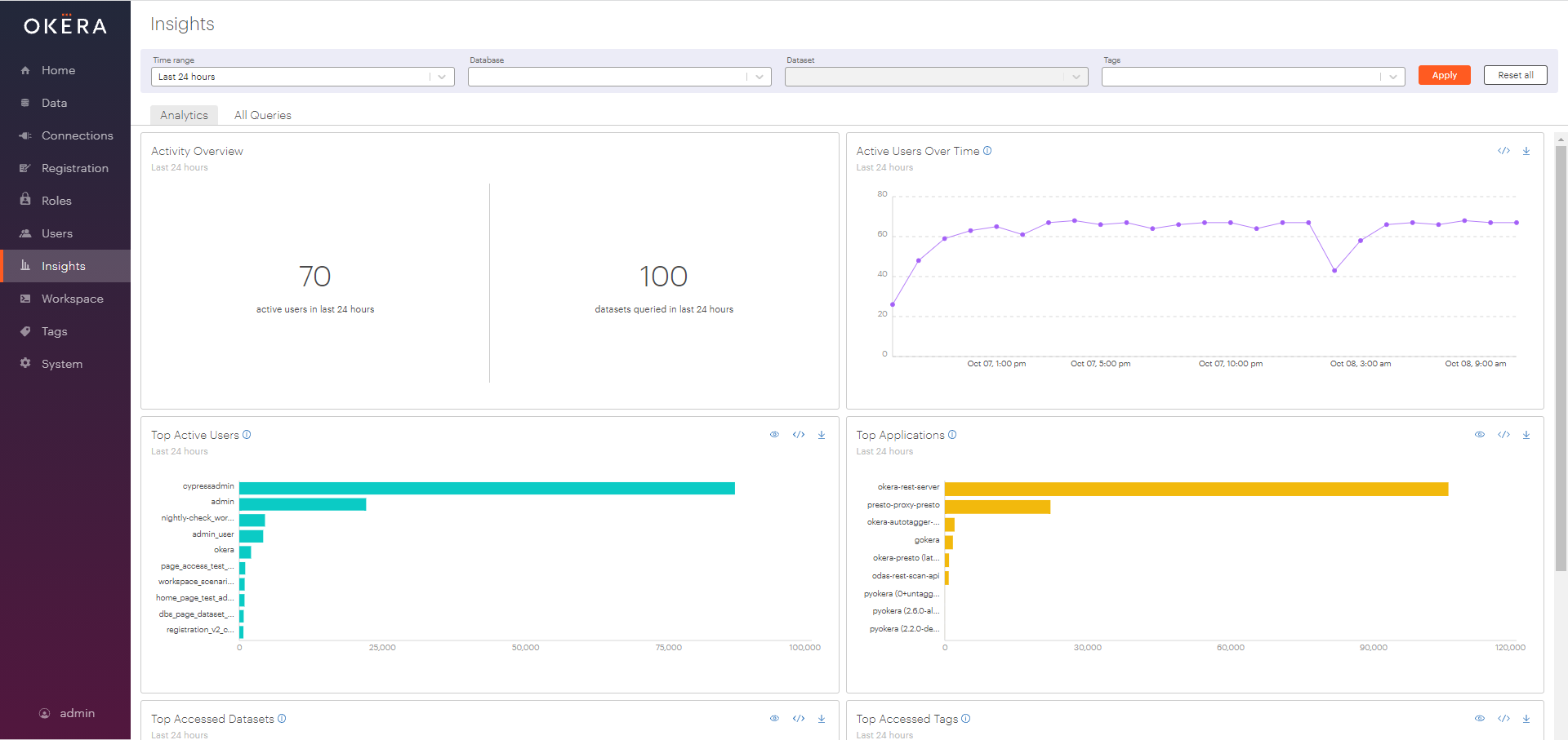
Insights Page
The Okera Portal provides an Insights page where usage analytics about system events can be viewed.
If users are allowed access to this page, they can select a time range over which to view analytics and filter them by database, dataset, and tags.
Insight analytics are presented in visuals that are generated using Presto to query the reporting audit table (okera_system.reporting_audit_logs),
which is derived from the Okera audit logs (for more on the structure of the audit logs, see Auditing).
Enabling the Insights Page
See Access to the Insights Page for information on enabling access to the Insights page.
Note that even though a user has access to the Insights page, the audit views only show audit log data pertaining to the datasets for which a user has VIEW_AUDIT or ALL privileges.
Filters
Filters at the top of the page can be used to filter the visuals by time range, databases, datasets, and tags. When applied, these filters apply to all of the visuals, not only the ones related to that particular entity type. For example, filtering by a dataset or set of datasets will not only filter the data in the "Top Accessed Datasets" visual, but also all others.
Filter conditions are combined using an AND operator. When more than one filter condition is specified, only data for events in which all conditions are met is shown. For example, when a database and tag are specified as filter conditions, only events pertaining to both the database and the tag are counted.
Note: You must select Apply after specifying filters for your filters to be applied and the visuals regenerated.
Database and Dataset Filters
By default, visuals show aggregated metrics for all of the datasets for which the current user has the VIEW_AUDIT or All permission.
Users can change which database, dataset or set of databases and datasets the visuals show using the multi-select drop-down boxes at the top of the Insights page. Only databases and datasets the current user has VIEW_AUDIT or ALL privileges on will appear in the dropdowns. The datasets dropdown only shows datasets in the currently selected databases.
Tags Filter
The tags filter allows you to filter visuals for only events related to data with the selected set of tags.
Time Range
The default time range on the Insights page is Last 24 hours. This causes every visual on the page to show data only for queries that occurred in the 24 hours prior to the moment you accessed the Insights page. The following options are available for Time range:
- Last 24 hours: This is the default. Visuals show data from the 24 hours prior to accessing the page.
- Last 7 days: Visuals show data for the seven days prior to accessing the page.
- Custom range: When this option is selected, two date pickers appear, one for the start time and one for the end time. When a custom time range is selected, visuals show data for events that occurred from the beginning of the start date through the end of the end date. The available dates in the custom time range picker go back 90 days from the current date.
Note: For large deployments, longer time ranges will take some time to load. The page will not time out, but will wait for Presto to return results. Up to 90 days can be selected custom ranges, but more than a week or two may take tens of minutes to return.
Visual Elements
Each visual consists of a heading, a chart, and some interaction icons. For example, here is the "Top Accessed Datasets" visual:
- The heading at the top consists of a title, subheader, and info icon (
 ).
The subheader describes the time frame shown, as well as filters that are applied to the data.
Mousing over the info icon will show a short explanation of the visual.
).
The subheader describes the time frame shown, as well as filters that are applied to the data.
Mousing over the info icon will show a short explanation of the visual. - The chart in the middle is a graph, a table, or a value.
- The interaction icons are on the top right of the visual. The interactions available vary, based on the visual.
The "Top Accessed Datasets" visual shows all three options:
- View all (
 ) - Some visuals only show the top 10 results by count.
Select this icon to display a table of all of the results found.
) - Some visuals only show the top 10 results by count.
Select this icon to display a table of all of the results found. - View SQL (
 ) - Select this icon to display the SQL used to generate the visual.
For users with access to Workspace, there is also a link to Open in Workspace, where the SQL can be run to see the raw results.
) - Select this icon to display the SQL used to generate the visual.
For users with access to Workspace, there is also a link to Open in Workspace, where the SQL can be run to see the raw results. - Download as CSV (
 ) - Select this icon to download the visual data as a CSV file.
- View all (
Drill-Down Functionality
For many visuals, users can drill down further by selecting any data point in the visual. This displays a sample of up to 100 queries run for the selected data point, allowing users to explore the underlying data powering the visuals.
For users with Workspace access, a link to view the full details in Workspace is also provided. When this link is selected, the drill-down query is prepopulated in Workspace. Each visual has a slightly different drill-down query, but they all follow a similar pattern: a query that selects fields of interest from the visual view, followed by filters that restrict the results by time, other filters, and the constraints that match the data point. For example, the drill-down query for Top Accessed Datasets looks like this:
  SELECT
  start_time_utc,
  user,
  statement_type,
  statement,
  status,
  ae_table,
  ae_attribute,
  client_application,
  start_unix_time
FROM
  okera_system.reporting_audit_logs
WHERE
  (
    ymd BETWEEN '2020-05-23'
    AND '2020-05-24'
    AND start_time_utc >= from_iso8601_timestamp('2020-05-23T00:46:41')
    AND start_time_utc <= from_iso8601_timestamp('2020-05-24T00:46:41')
  )
  AND (
    cardinality(
      array_intersect(
        split(ae_table, ','),
        ARRAY ['okera_system.role_names']
      )
    ) > 0
  )
ORDER BY
  start_time_utc DESC
LIMIT
  100
There are a few things to note about this query:
- The fields are selected from
okera_system.reporting_audit_logs, a special system view that the exposes data from the audit logs. - The data is restricted by both
ymdANDstart_unix_time. This seems redundant, but it improves performance by first choosing the right partition and then restricting data by timestamp. Note that the dates and times are in UTC time, so they may not match the local times and dates selected for the time range. The selected local time has been converted to the corresponding UTC time. - Finally, the query adds a filter to only show events on the dataset
okera_system.role_names, which was the data point selected to produce this drill-down query.
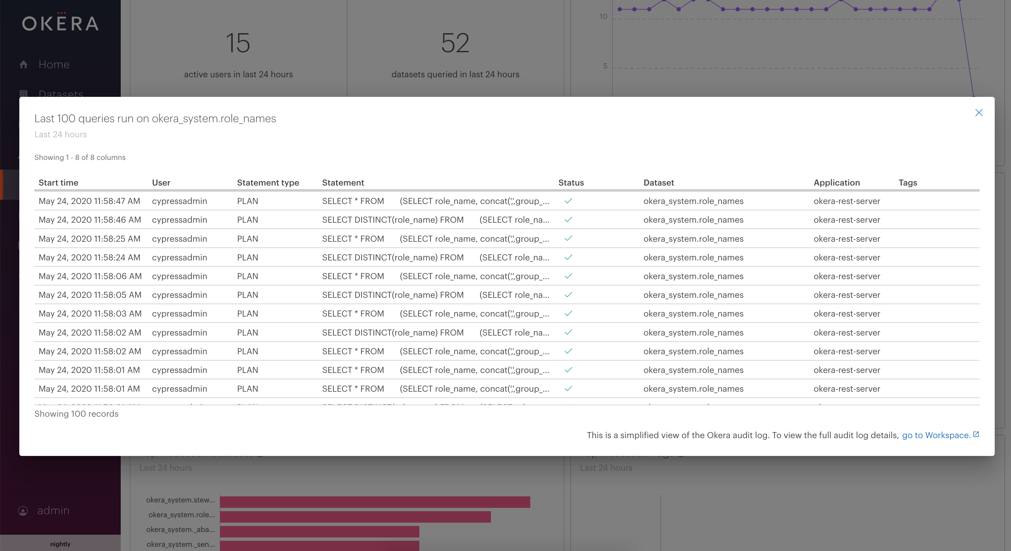
The go to Workspace link in the drill-down preview opens the query in Workspace, where you can modify the query to find other visuals. If you need to see more results, you can use the same query in an Amazon EMR cluster or whatever other client application you use to query data through Okera.
Understanding Visuals
There are two tabs, with a total of eight visuals on the Insights page. On the first tab, Analytics, there are six visuals that show summaries of the activity for various entities in the Okera deployment.
- Activity Overview
- Active Users Over Time
- Top Active Users
- Top Applications
- Top Accessed Datasets
- Top Accessed Tags
The second tab, All Queries, contains two visuals showing queries in the system.
Activity Overview
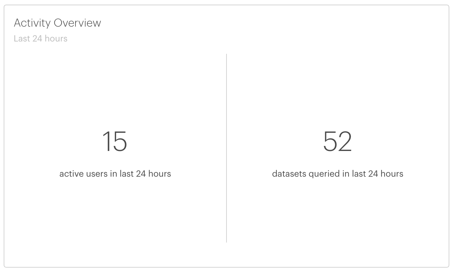
This visual provides a summary of activity in the Okera deployment in the form of two numbers. The first number is the number of unique active users of the system in the selected time range. These are users that ran at least one query in that time.
The second number is the number of datasets queried at least once in the selected time range.
This summary visual does not include any interactions.
Active Users Over Time
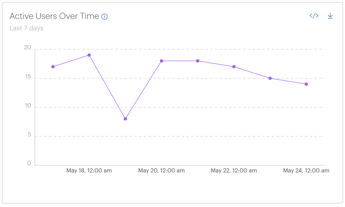
This visual shows the number of active users over time within the selected time range. If the selected time range is a day or less, it shows the number of active users per hour. If the selected time range is more than one day, it shows the number of active users per day. Each data point represents the number of active users between the time displayed at that data point and the next data point. For example, the point labeled 11:00 am shows the number of active users for the whole 11 o'clock hour.
Clicking on a data point displays a list of events contributing to the number of active users during that time.
Select the View SQL (![]() ) button to see the Presto-SQL used to generate the visual. For example (comments added):
) button to see the Presto-SQL used to generate the visual. For example (comments added):
SELECT
  startTime,
  count(distinct(user)) as count
FROM
  (
    SELECT
      -- startTime is computed by converting the stored utc time to local time,
      -- then only using the date portion to group events based on date
      date_format(
        start_time_utc AT TIME ZONE 'America/Los_Angeles',
        '%Y-%m-%d'
      ) as startTime,
      user
    FROM
      okera_system.reporting_audit_logs
    WHERE
      -- ymd is a partitioning column. The right partitions are first selected,
      -- then the time is further restricted to the necessary hours.
      -- These parameters have been converted from local time to UTC time
      (
        ymd BETWEEN '2020-05-01'
        AND '2020-05-17'
        AND start_time_utc >= from_iso8601_timestamp('2020-05-01T07:00:00')
        AND start_time_utc <= from_iso8601_timestamp('2020-05-17T06:59:59')
      )
      AND user > ''
  )
GROUP BY
  startTime
ORDER BY
  startTime
startTime and adds a distinct count of users.
Note again that the filter used to restrict the time range of data selected is in UTC time.
Because the logs are stored in UTC time in the database, the time selected by the user is converted to UTC time. This means dates may not match the local dates.
The aggregation is then done in local time.
Top Active Users
As the name implies, this visual shows a list of the top ten users in the system, ranked by the number of queries they ran in the selected time range.
Select any row to see some of the queries run by a particular user.
To see a complete list of users, select the View all (![]() ) button.
Selecting View SQL (
) button.
Selecting View SQL (![]() ) shows the SQL used to generate the visual.
) shows the SQL used to generate the visual.
Top Applications
This visual shows the most popular client applications ranked by number of queries run in the given time range.
The top ten client applications are represented as bars in a bar chart, and more applications can be shown by selecting the View all (![]() ) button.
Hover over the bars in the visual to see the number of queries for an application.
) button.
Hover over the bars in the visual to see the number of queries for an application.
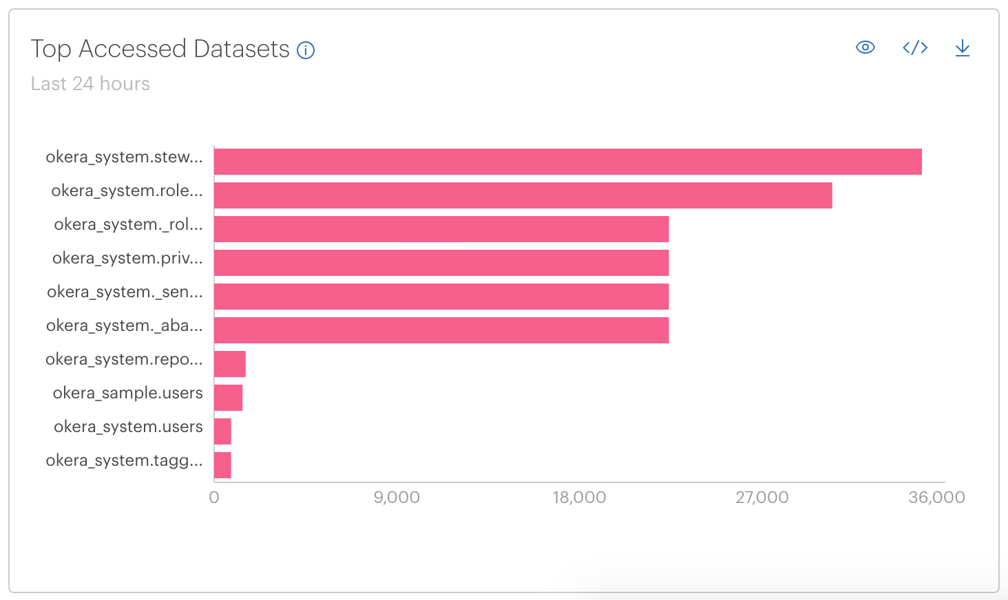
Top Accessed Datasets
This visual shows the most queried datasets in the selected time range.
The top ten datasets are represented as bars in a bar chart, and the rest can be viewed by selecting View all (![]() ).
Hover over the bars in the visual to see the number of queries for a dataset. Select a bar to see the events used to calculate the count.
In the case of joins or other operations that involve more than one dataset, each dataset is counted independently.
).
Hover over the bars in the visual to see the number of queries for a dataset. Select a bar to see the events used to calculate the count.
In the case of joins or other operations that involve more than one dataset, each dataset is counted independently.
Top Accessed Tags
This visual shows the most accessed tags in the selected time range. This is a count of queries that include that tag.
The top ten tags are represented as bars in the bar chart, and the rest can be viewed by selecting View all (![]() ).
Hover over the bars in the visual to see the number of queries that include a tag.
).
Hover over the bars in the visual to see the number of queries that include a tag.
Queries Over Time
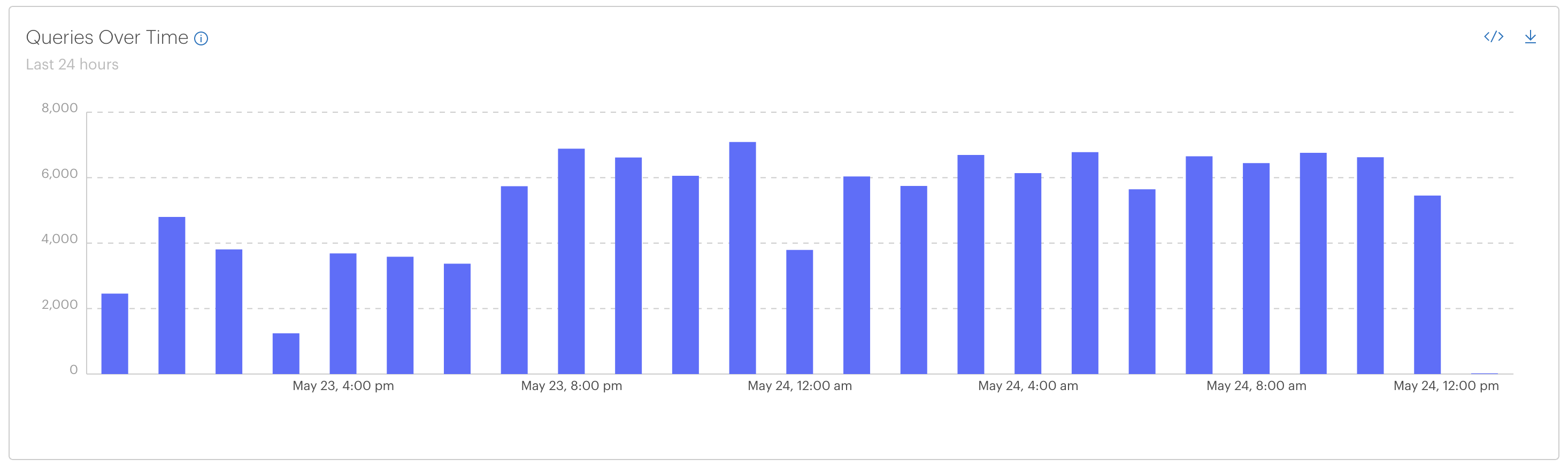
This visual shows the number of queries that occurred during the selected time range as a bar chart with each bar representing the sum of queries in a subset of the time range (a time bucket). For time ranges of a day or less, each bar represents an hour of data. For time ranges of more than a day, each bar represents a day.
Queries Over Time supports drilling down to see a list of some of the queries run in a particular time bucket. To drill down, select a bar. A modal appears that displays a sample of queries run in this time bucket.
Recent Queries
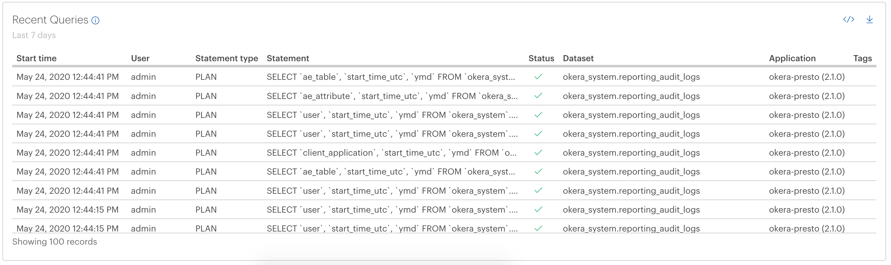
This visual shows a table of the 100 recent queries that were run in the selected time range.
To view more, use the SQL shown by selecting View SQL (![]() ) to run a query using Presto in your SQL environment of choice.
) to run a query using Presto in your SQL environment of choice.
Implementation Notes
Time Values
The times shown in the visuals are all in client-local time. Times stored on the server (and therefore part of drill-down queries) are stored as UTC time in milliseconds and represent when each event happened on the server. Each event is counted at its start time, not its end time, although end times are included in the logs.
When Is Data Available?
Visual data is updated every five minutes. Queries run in the last five minutes are logged, but may not be reflected in the visuals. Every five minutes a watcher task processes the audit logs, adding them to the corresponding query-able table.
What Is Counted?
Queries are not counted 1-to-1 in the audit logs; Okera logs more than one event per user query.
For each query, Okera logs a PLAN event, plus some number of SCAN events, depending on the scale of the data being scanned.
For very large scans, the number of events logged can be very high.
All of these events are shown in queries on the audit logs, but in visuals most of them are rolled up into a small number of events.
The visuals reflect a low constant number of events per query.
The exact number depends on the client and query type, but not on scale of data scanned.
So, for similar queries from the same source, the numbers in the visuals are consistent.